Bosch Website Relaunch
Turning a complex corporate ecosystem into clear paths for products, careers and company content — across every screen size.
Overview
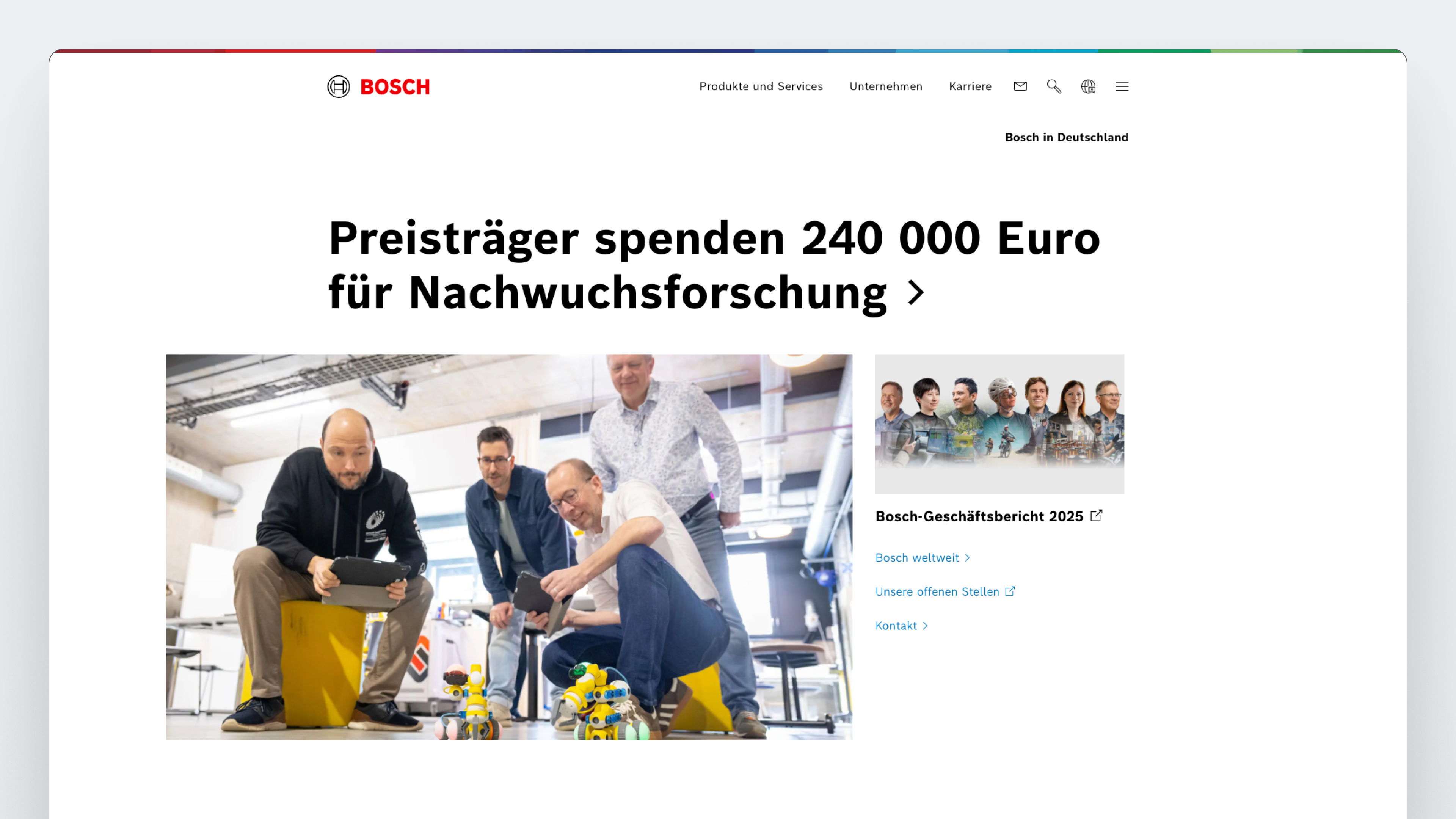
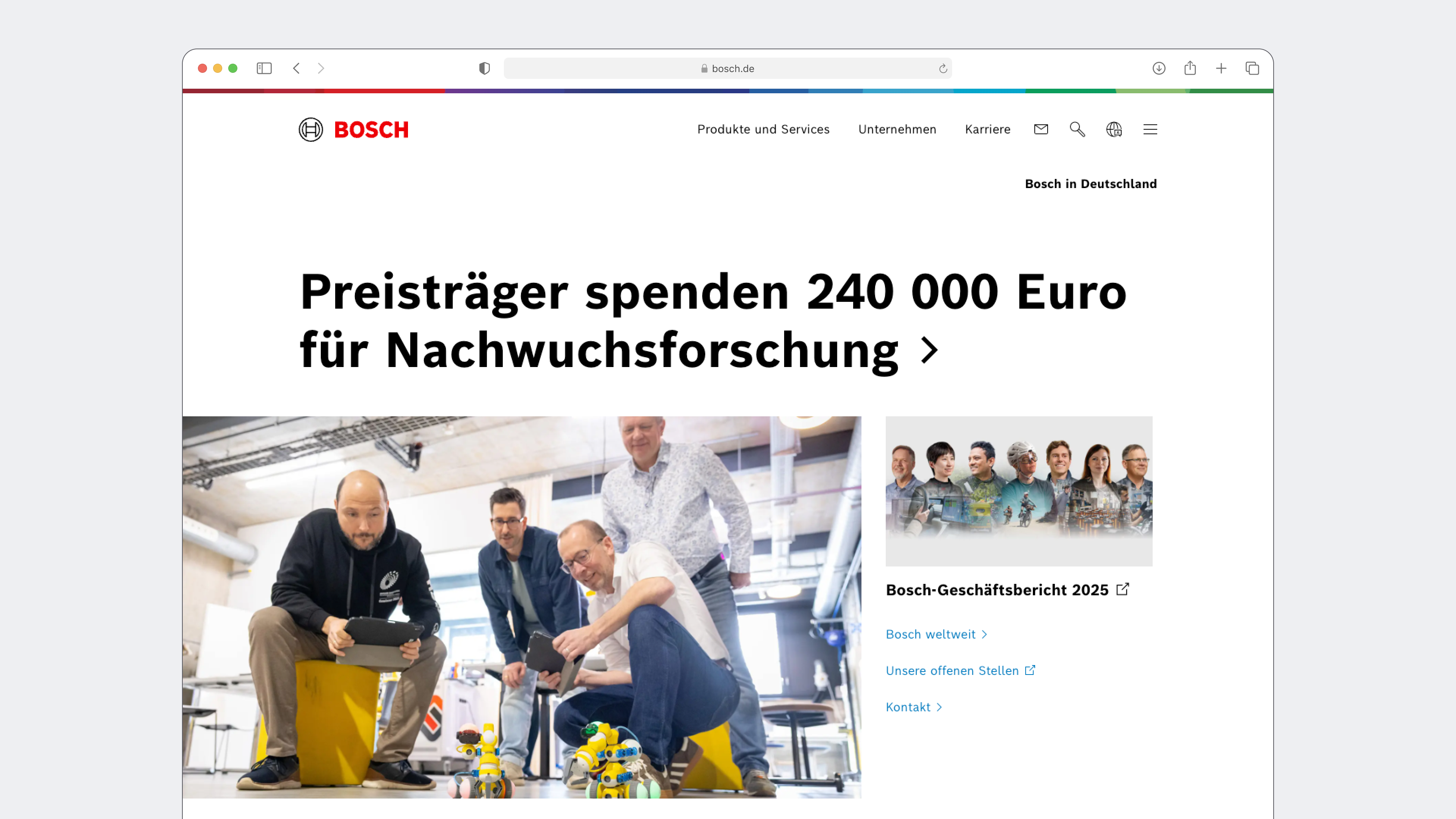
Bosch.de is a central digital touchpoint for products and services, company information and careers. The relaunch reorganised this broad ecosystem around recognisable user intent instead of expecting visitors to understand the corporate structure behind it.
I worked mobile-first across research, information architecture, wireframes, interactive prototypes and user testing. The result was a clearer content hierarchy and a reusable responsive system for a wide range of Bosch topics and audiences.
Challenge
The challenge was not a lack of content. It was helping very different audiences recognise their next step without first learning how Bosch business units are organised.
- Translate a large corporate portfolio into understandable audience pathways.
- Preserve one content hierarchy from wide desktop layouts to focused mobile screens.
- Make deep navigation manageable without hiding important destinations.
- Create reusable patterns that work across products, careers and corporate content.
Information architecture
A single principle guided the architecture: label entry points by the goal a visitor recognises, then reveal organisational depth only when it becomes useful. Mobility, home, industry and trade, careers and company content became understandable destinations rather than expressions of an internal structure.
Content audits and wireframes helped test this hierarchy before visual detail was introduced. Interactive prototypes then made the structural decisions tangible for stakeholders and users.
Responsive system
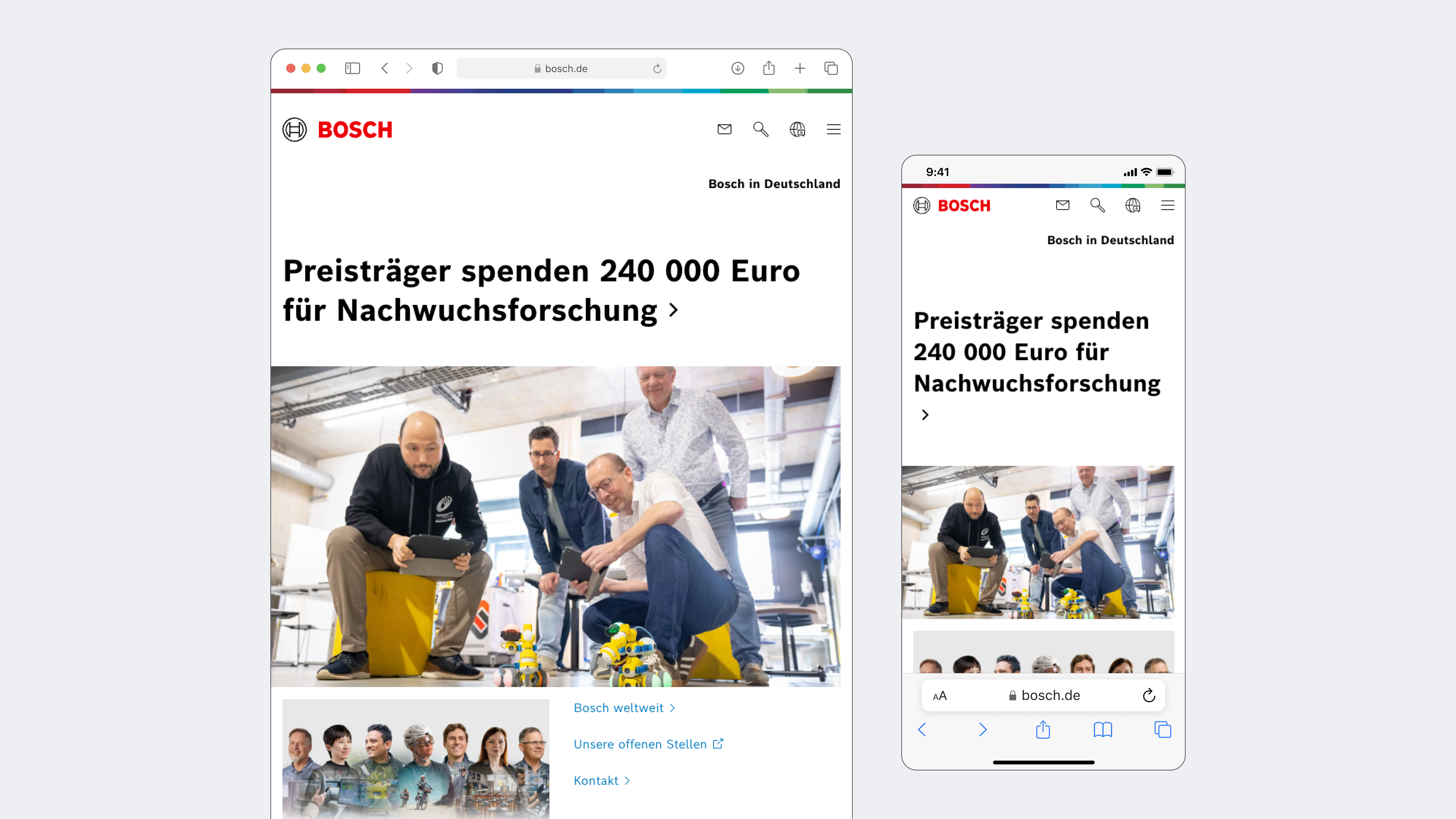
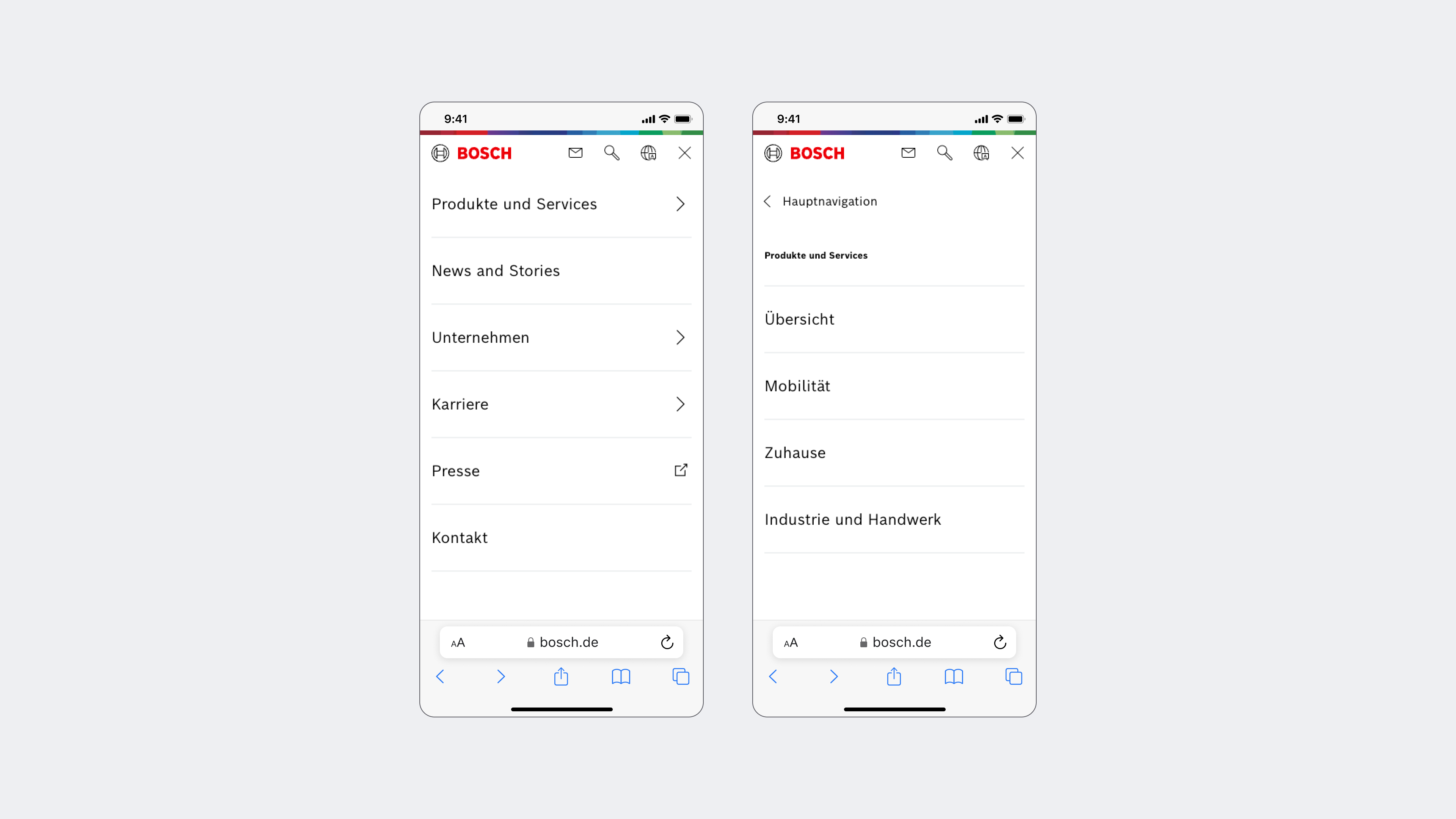
One hierarchy drives every viewport. Desktop uses the available width to show context and related paths together; tablet and mobile sequence the same priorities into a focused reading order.
The layout changes its composition, not its meaning. Consistent labels, content order and interaction patterns allow people to move between devices without learning a second version of the website.
Responsive header
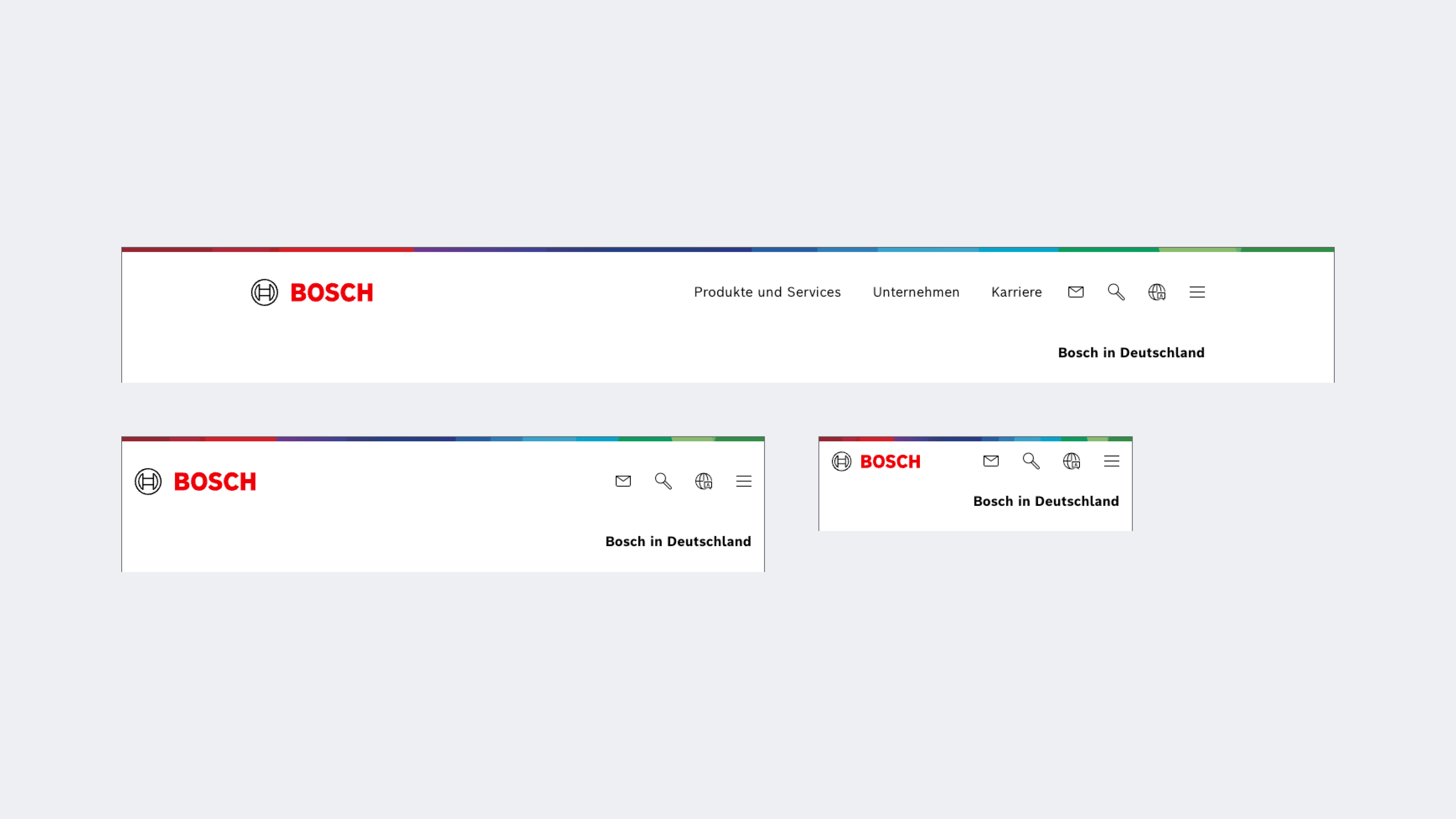
The header keeps the Bosch brand, core actions and local context recognisable at every breakpoint. Primary navigation is visible when space allows and moves into the menu when the viewport becomes constrained.
This creates a stable orientation layer: the visual identity and frequent actions remain familiar while only the navigation density changes.
Scalable page patterns
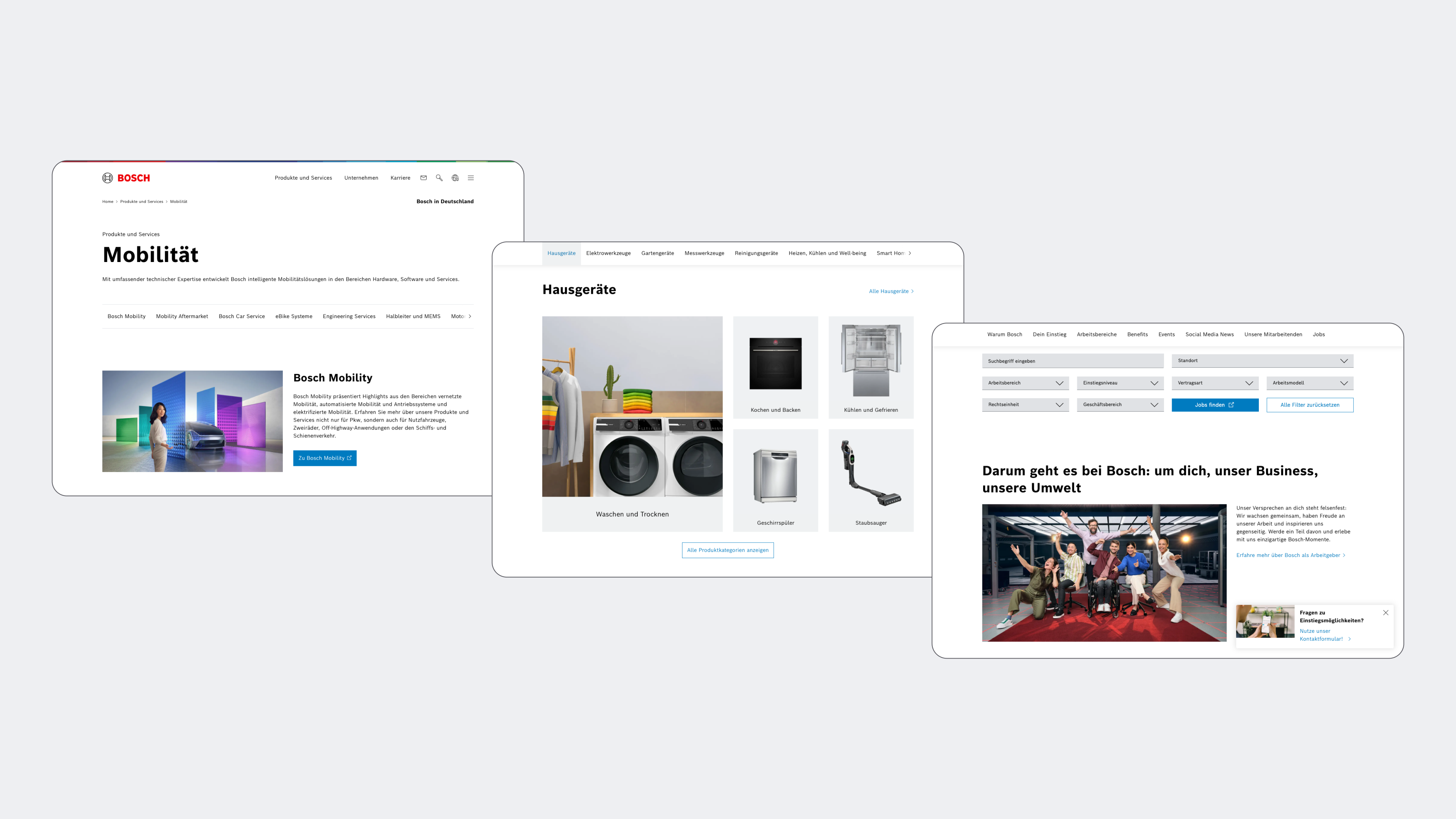
The same system had to support very different journeys: exploring mobility services, browsing household products and finding a role at Bosch. Shared rules for headers, page introductions, local navigation, content modules and calls to action create consistency without forcing every page into the same composition.
This balance between reusable structure and flexible content allows teams to publish distinct experiences while keeping the wider ecosystem coherent.
Impact
- Recognisable entry points replaced organisation-led navigation.
- A shared responsive hierarchy connected desktop, tablet and mobile experiences.
- Reusable page and navigation patterns created consistency across teams and topics.
- Mobile-first prototypes made structural decisions testable early.
The outcome is described qualitatively; detailed engagement metrics remain client-owned. The website is live at bosch.de ↗.
Reflection
Good information architecture absorbs organisational complexity instead of asking users to learn it. The Bosch relaunch reinforced that responsive design works best when content priority is decided first and layout follows from it.
The same principle shaped the broader system: stable navigation, reusable page patterns and clear responsive rules made a large ecosystem feel like one website without erasing the differences between its audiences.