← All workShipped client work · Selected contributions
Porsche Design System
A scalable design system foundation for consistent digital product experiences, including UI components, typography, layout principles and documentation patterns.
One visual language across brand expression, interaction and reusable components.
Overview
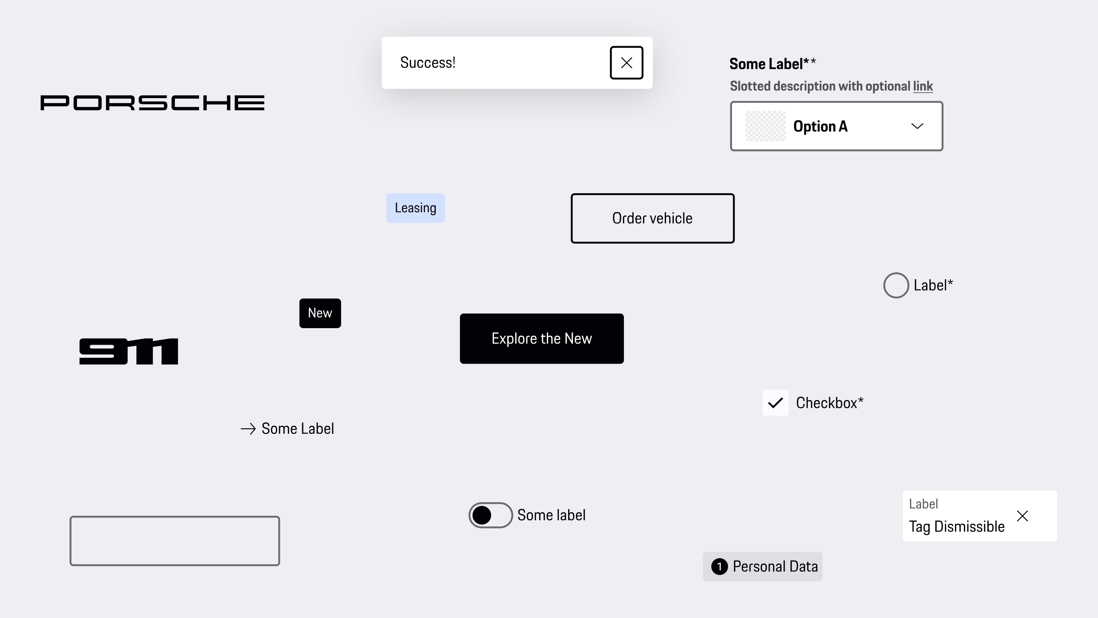
The Porsche Design System is a public toolkit for brand-driven web applications, combining Figma libraries, design tokens, patterns, templates, guidelines and coded Web Components. Its npm packages support modern frameworks through TypeScript-based Web Components with SSR support.
I contributed to guidelines, component design and accessibility — designing and specifying patterns that had to work for many teams, many products and one uncompromising brand. The public documentation identifies coded components as the source of truth, with the Figma library kept in sync.
Public system context verified against Porsche Design System v4 ↗. No public efficiency claim is presented as the outcome of my individual contribution.
Contribution & evidence
My contributionSelected foundations, component design, accessibility guidance and documentation patterns.
Team contributionSystem strategy, coded components, review, release and adoption across products.
Shipped scopeSelected contributions within a public, production design system.
Evidence levelPublic system reference plus illustrative reconstructions of the design logic.
Challenge
A design system for a premium brand has to solve two problems at once: consistency at scale, and quality that survives being used by teams the system team never meets.
Components must be flexible enough for configurators, shops and content platforms — but strict enough to stay unmistakably Porsche.
Accessibility is a quality standard, not an add-on: components ship WCAG-conformant by default.
Documentation must answer questions before they reach the system team.
System model
The work followed one continuous logic: translate brand character into principles, turn those principles into reusable rules, then prove the rules in products. Each layer narrows interpretation without removing the flexibility teams need.
01Design LanguageBrand character becomes interface principles.
02GuidelinesPrinciples become clear usage decisions.
03StylesVisual decisions become shared tokens.
04ComponentsTokens and behaviour become reusable UI.
05TemplatesComponents become repeatable page structures.
06ExamplesReal compositions show the system in context.
01 · Design Language
Five principles give the system its Porsche character.
Before defining components, we defined how a Porsche interface should feel and behave. The resulting principles connect brand expression, usability and accessibility across very different digital touchpoints.
01 / 05
01.1
Monochrome
A controlled scale of grey tones reduces cognitive load and puts vibrant media and status notifications in focus. The same restrained palette bridges touchpoints with different contexts while keeping one visual identity.
Using the provided colours instead of adding decorative ones also makes the interface easier to perceive for people with visual impairments.
System rule · Let content and status carry the colour.
01.2
Rounded
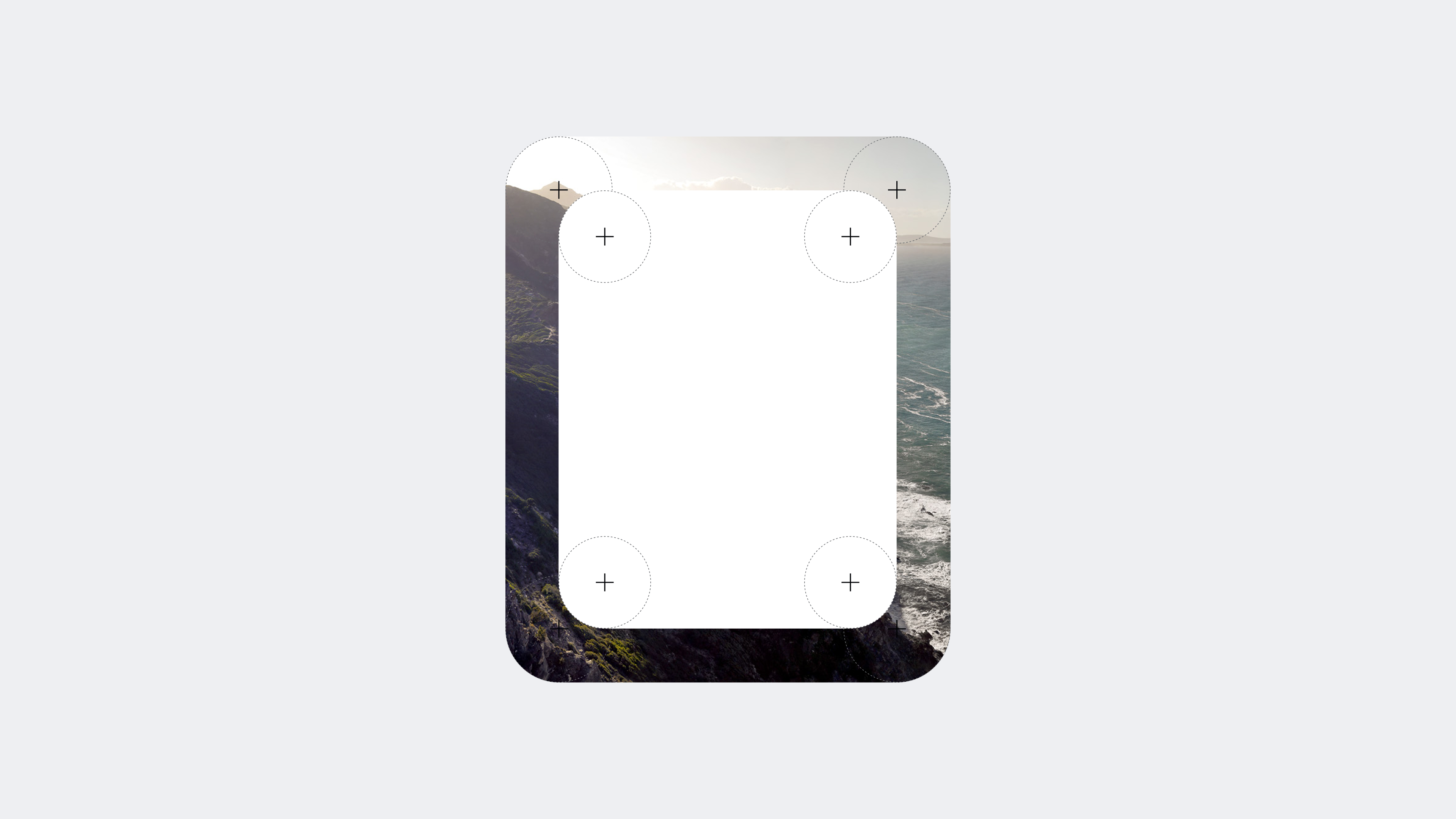
Slightly rounded corners echo Porsche’s modern shapes while keeping digital controls approachable. Three predefined radii give each role an intentional shape and create consistency across devices.
The softer geometry helps direct attention toward an element’s centre and supports touch interaction for people with motor impairments.
System rule · Use one of three radii; avoid sharp edges.
01.3
Space
Whitespace creates refinement while organising content without unnecessary framing. It separates elements, sharpens focus and makes hierarchy faster to understand.
Generous layouts and full-sized media increase emotional impact. Space is used deliberately to highlight the most important content or functionality.
System rule · Build hierarchy with space before adding containers.
01.4
Reduced
Interfaces contain only what people need to understand or complete the current task. Removing decorative and redundant elements lets vital information and functions stand out.
Less clutter improves perceived performance, supports faster task completion and reduces opportunities for error.
System rule · Every visible element needs a clear job.
01.5
Iconic
The crest, wordmark and distinctive brand palette translate Porsche’s recognition and emotional impact into digital products. Their strength comes from restraint, not repetition.
One iconic element at a time keeps the experience unmistakably Porsche without overwhelming the task. Every use follows the official brand guide.
System rule · Use brand identifiers sparingly and never alter them.
02 · Guidelines
Principles become decisions teams can repeat.
The guidelines translate the design language into practical boundaries for composition, interaction and brand expression. They explain not only what to use, but when restraint creates the stronger experience.
Brand expression
01 / 03
02.1
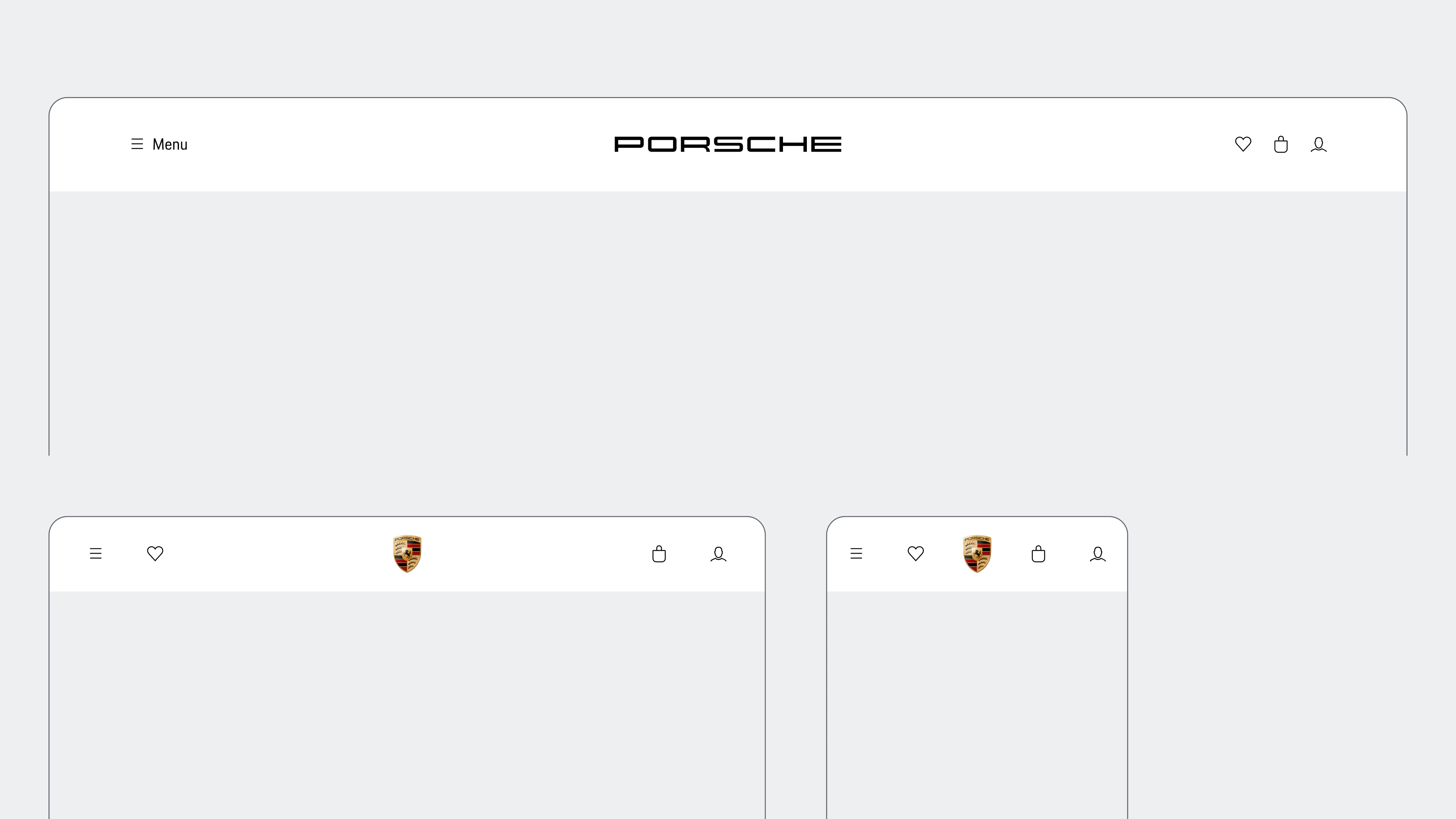
Use of wordmark
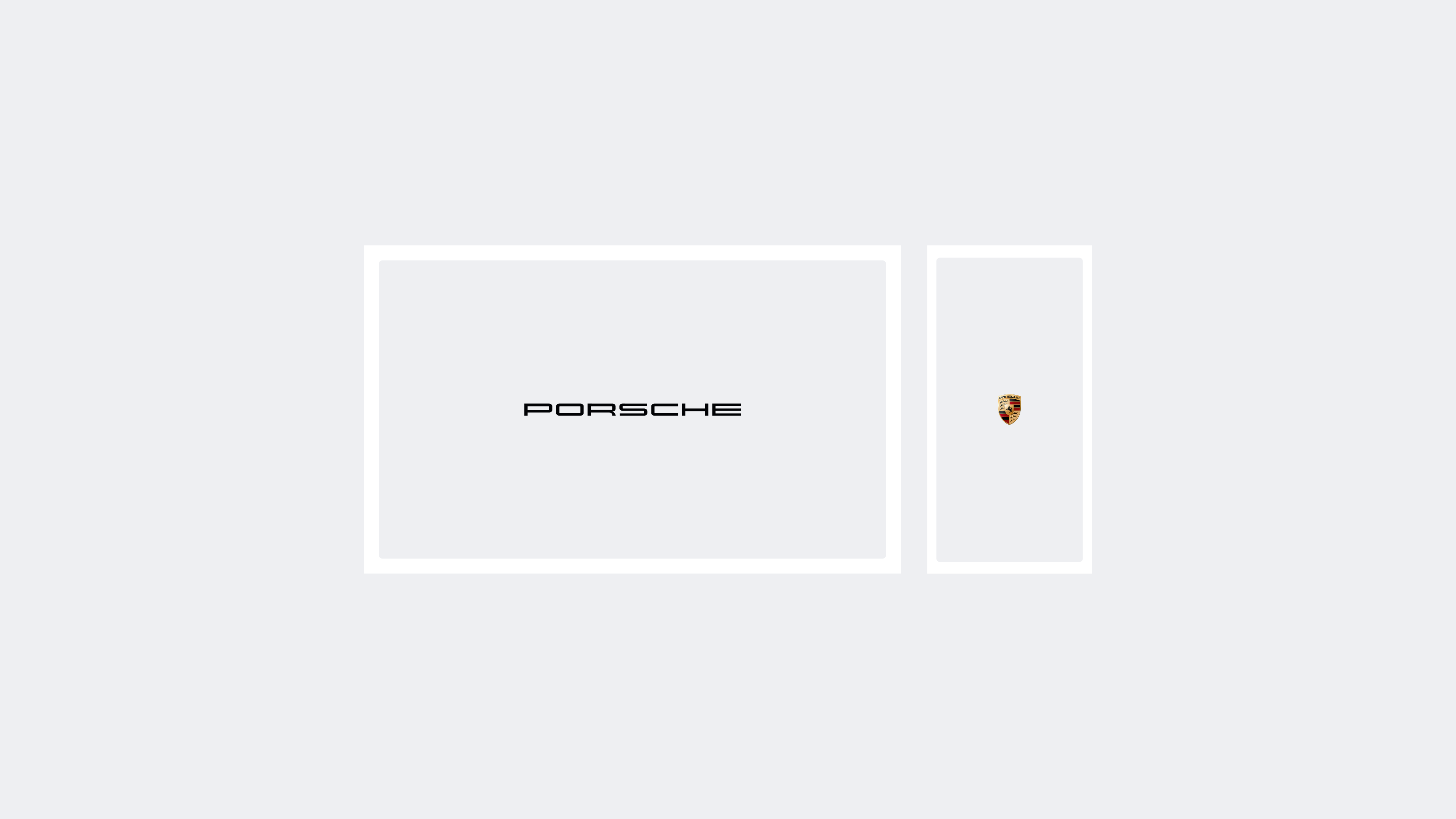
The Porsche Wordmark is the primary identifier and belongs in the global navigation. Additional appearances are avoided so the brand signal stays deliberate.
Centre the Wordmark whenever possible.
Maintain a sufficient safe zone around it.
Use the Porsche crest only when a small viewport cannot accommodate the Wordmark.
Guideline · One primary brand identifier per view.
02.2
Model Signatures
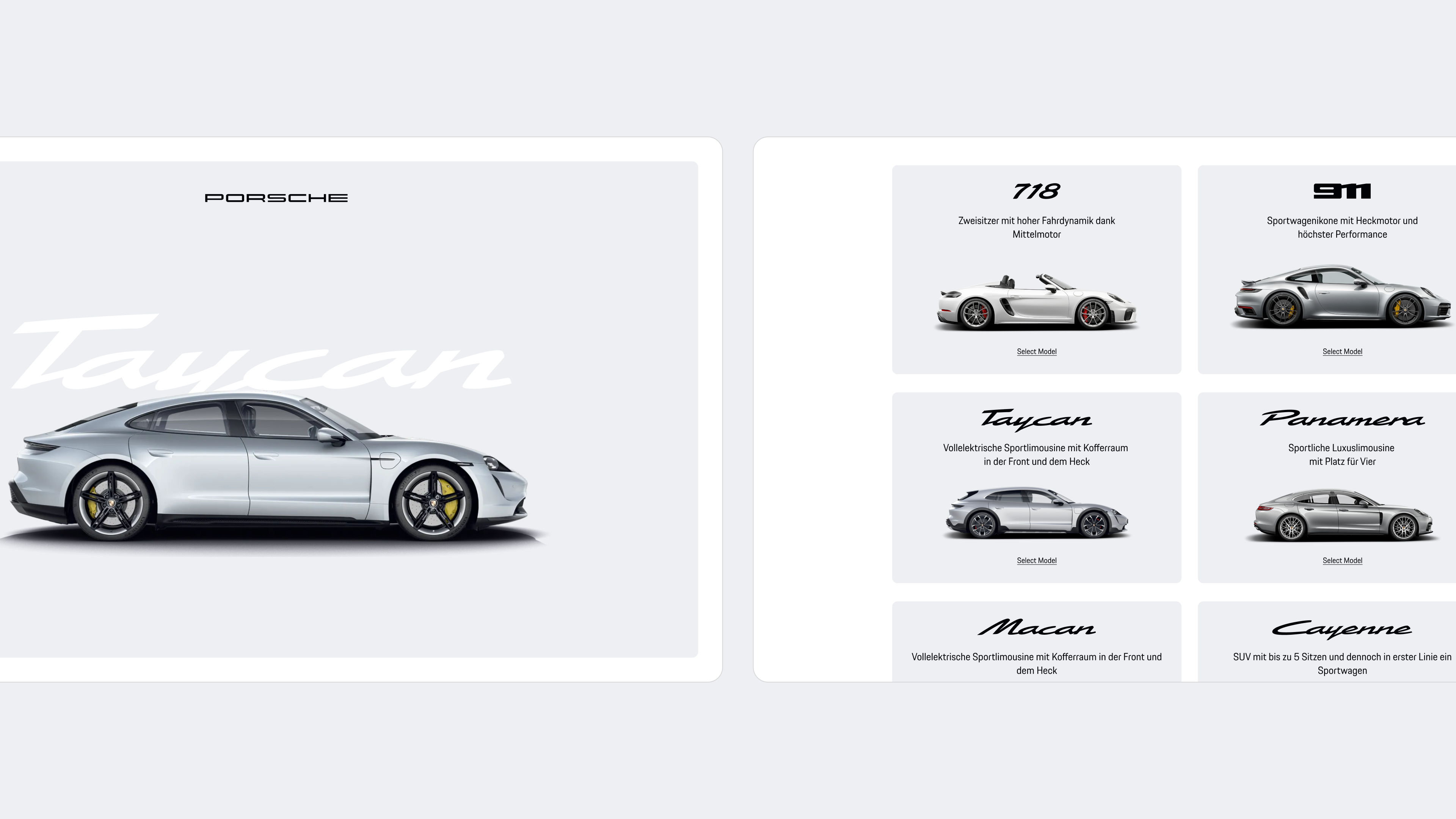
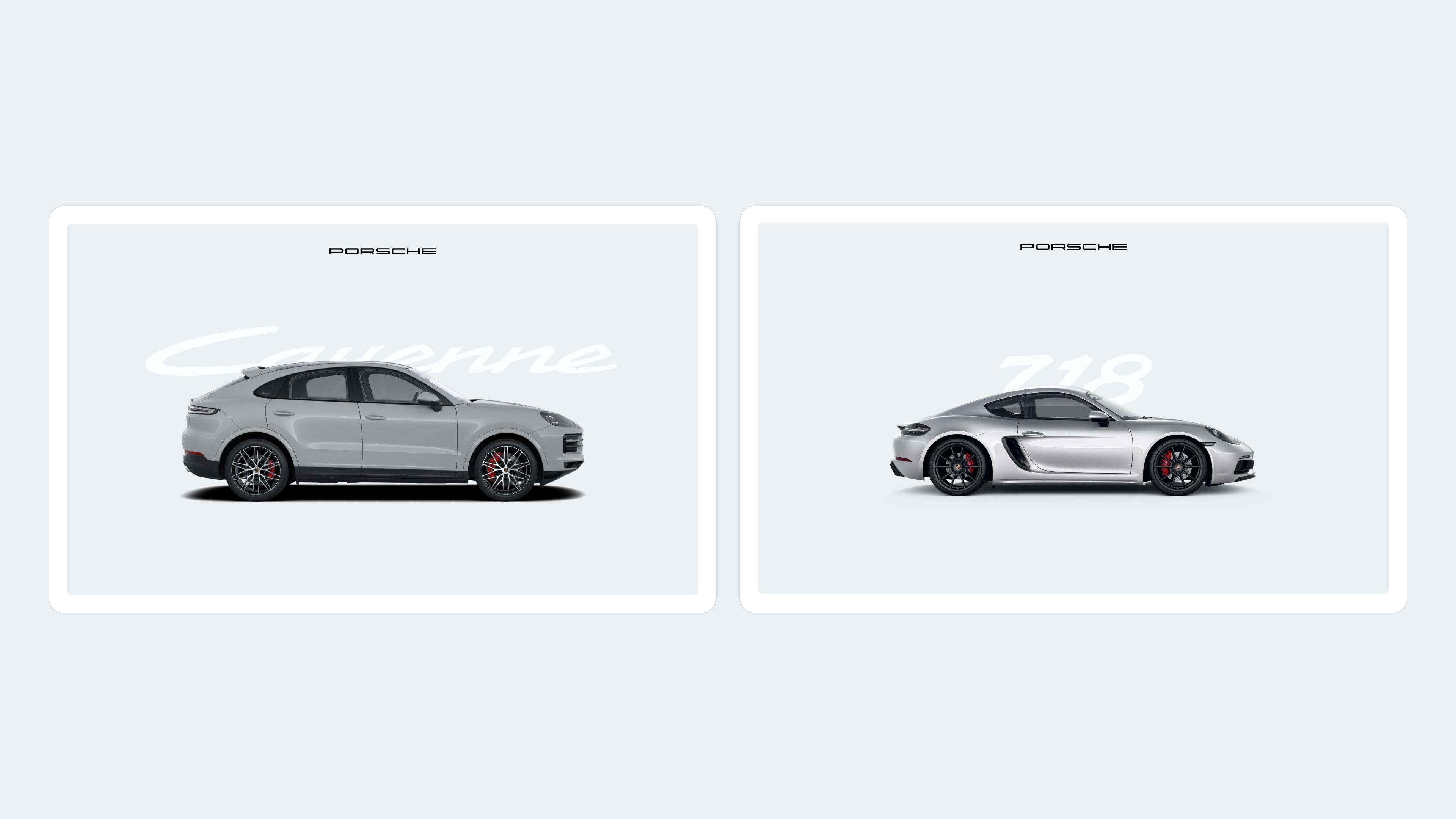
Signatures provide an emotional introduction and communicate a model series. They are not used for specific derivatives or long equipment variants.
Signatures may overlap cut-out vehicle images and can appear as background watermarks when the composition retains clarity.
Guideline · Use signatures for model families, not derivatives.
02.3
Dimensions of assets
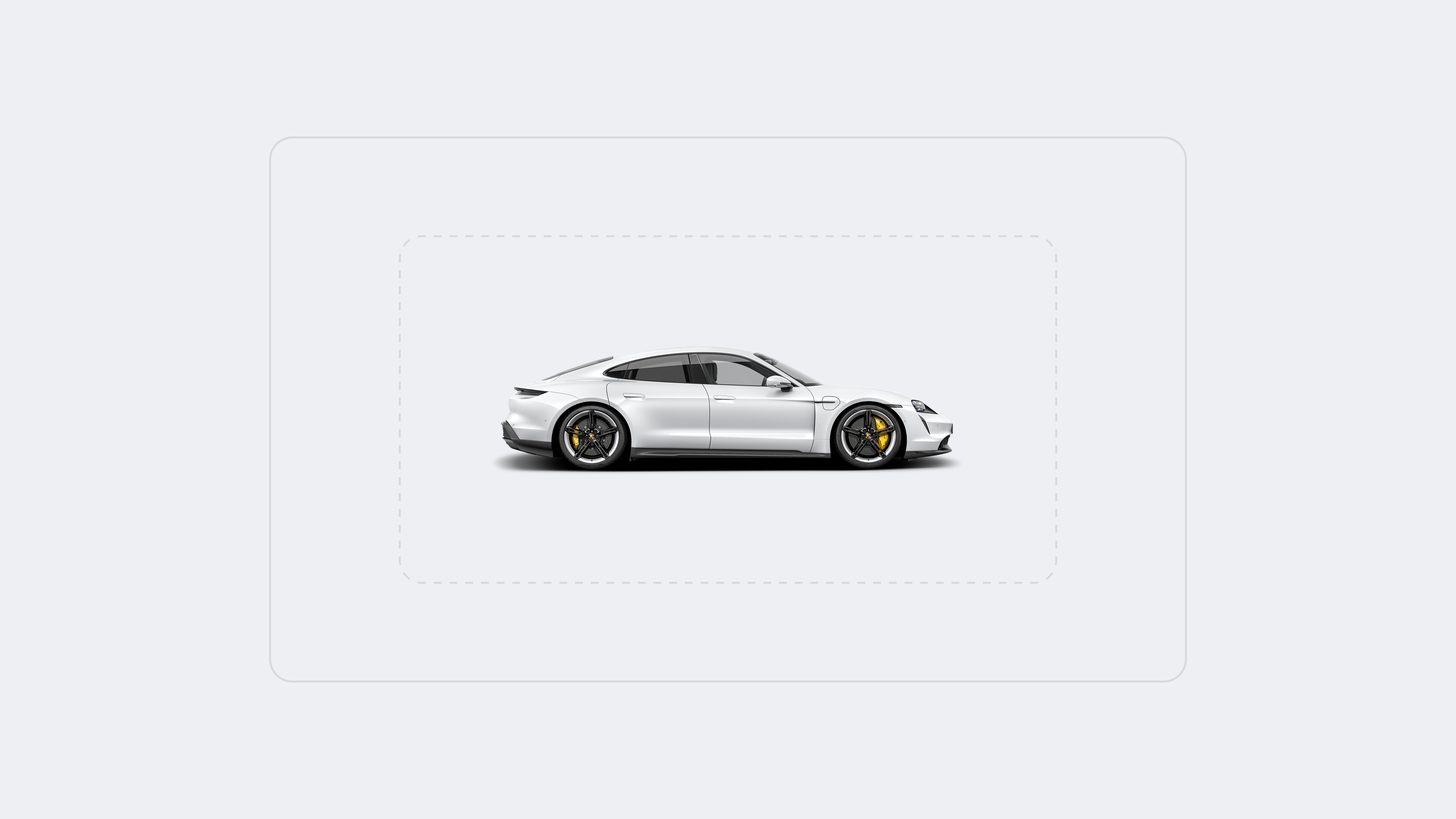
Vehicle visualisations and signatures are scaled proportionally across the product range. A 718 appears smaller than a 911, and a 911 smaller than a Cayenne—even when only one model is visible.
Rim sizes provide a practical reference for balancing proportions. The same relative scale applies to model signatures.
Guideline · Preserve relationships, not just individual asset size.
Interface composition
01 / 03
02.4
Reduction
Simplicity is the starting point. Every interface element has to justify its presence; anything unnecessary is removed.
Divider lines are replaced with additional space wherever hierarchy remains clear, reducing visual noise without losing orientation.
Guideline · Remove decoration before removing clarity.
02.5
Surface
Surface colour structures an interface by clustering related content. The default background remains the baseline; surface backgrounds are introduced for containers or full-bleed sections when they make grouping easier to understand.
Limit a focus area to no more than two surface containers.
For productive views, place default-background containers on a full-bleed surface.
Guideline · Use surface to create structure, not decoration.
02.6
Space
Content is allowed to breathe. Longer pages with intentional scrolling are preferred over tightly packed component groups.
The additional space reduces visual noise and keeps attention on the most important content and actions.
Guideline · Prefer more scroll to less focus.
Interaction rules
01 / 03
02.7
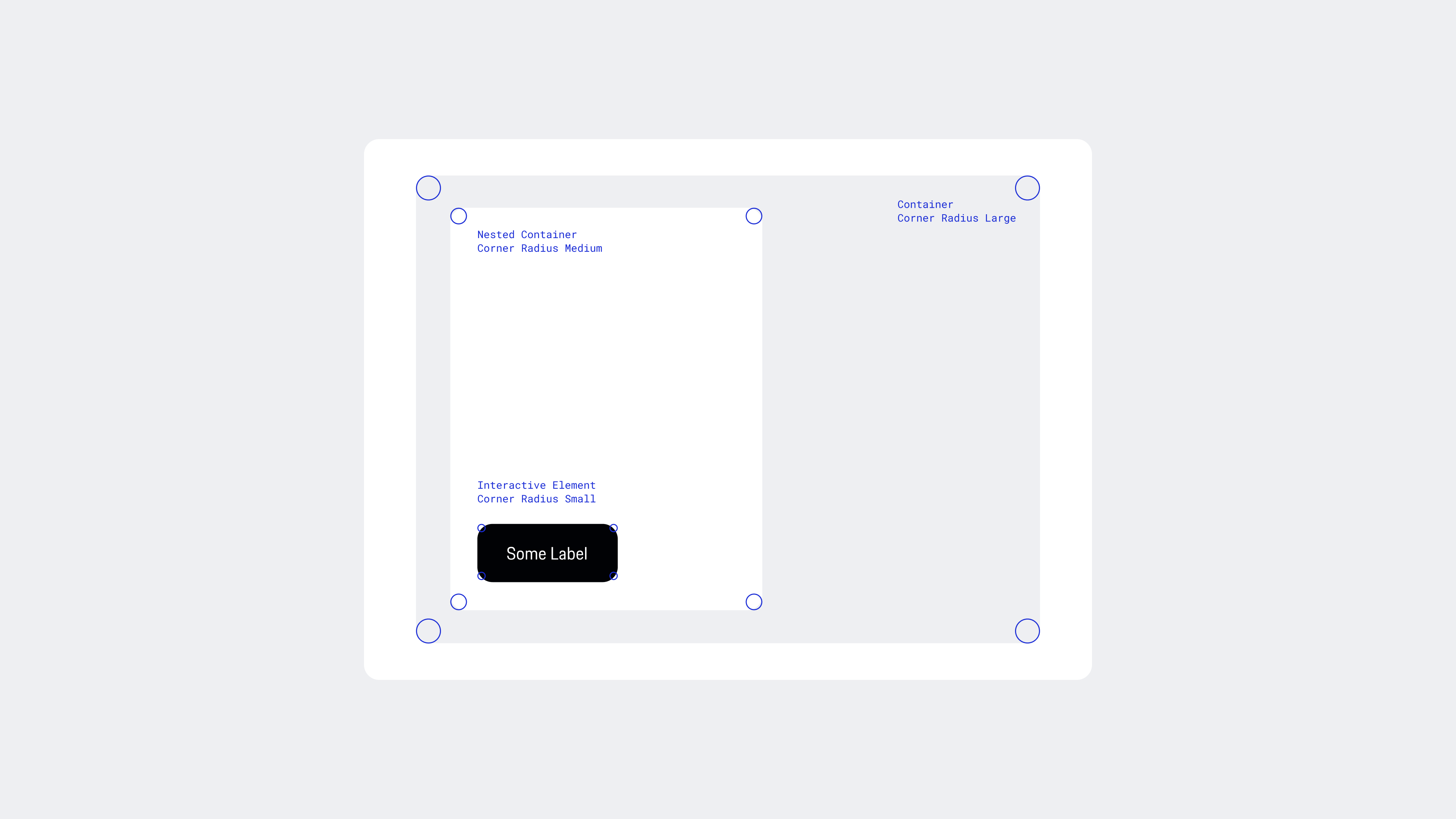
Rounded Corners
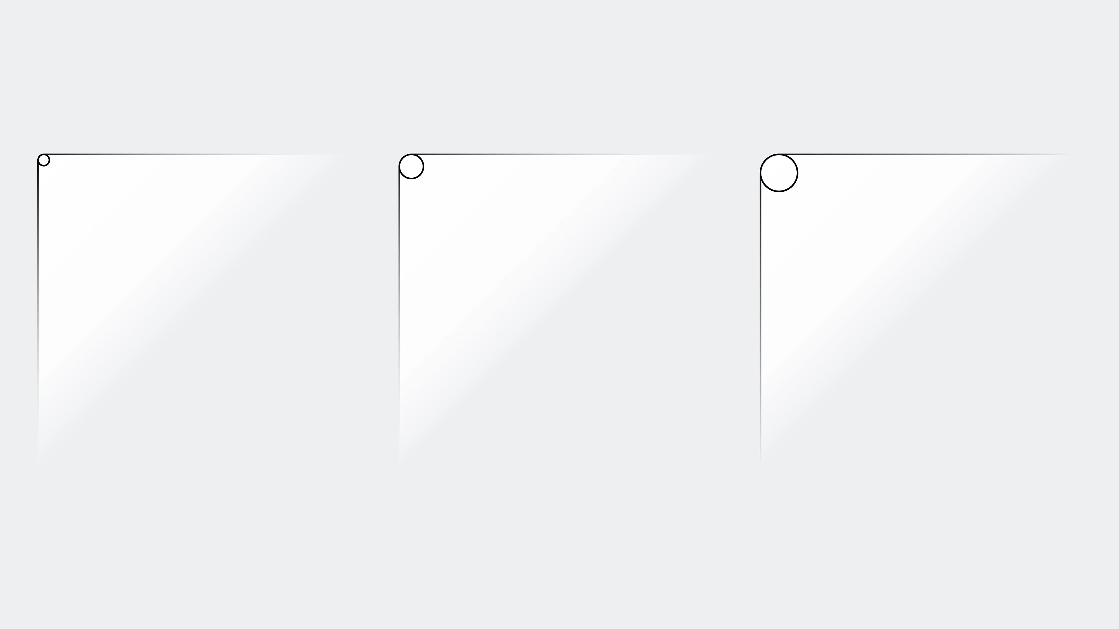
Rounded corners make interfaces more approachable while preserving a precise hierarchy. Radius is assigned by the role and nesting level of an element.
Small
Interactive elements
Medium
Nested elements
Large
Containers
Guideline · Radius communicates hierarchy.
02.8
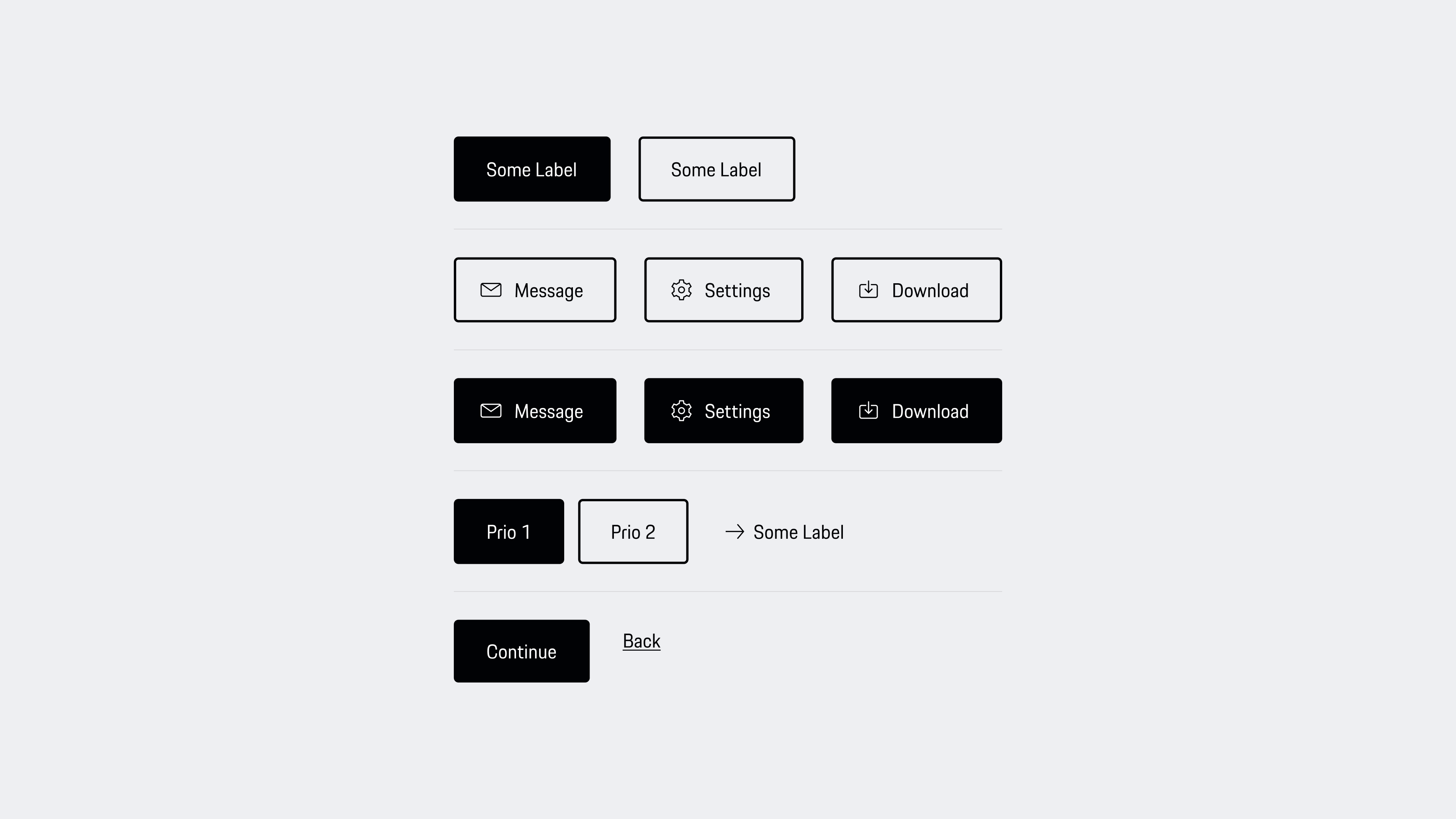
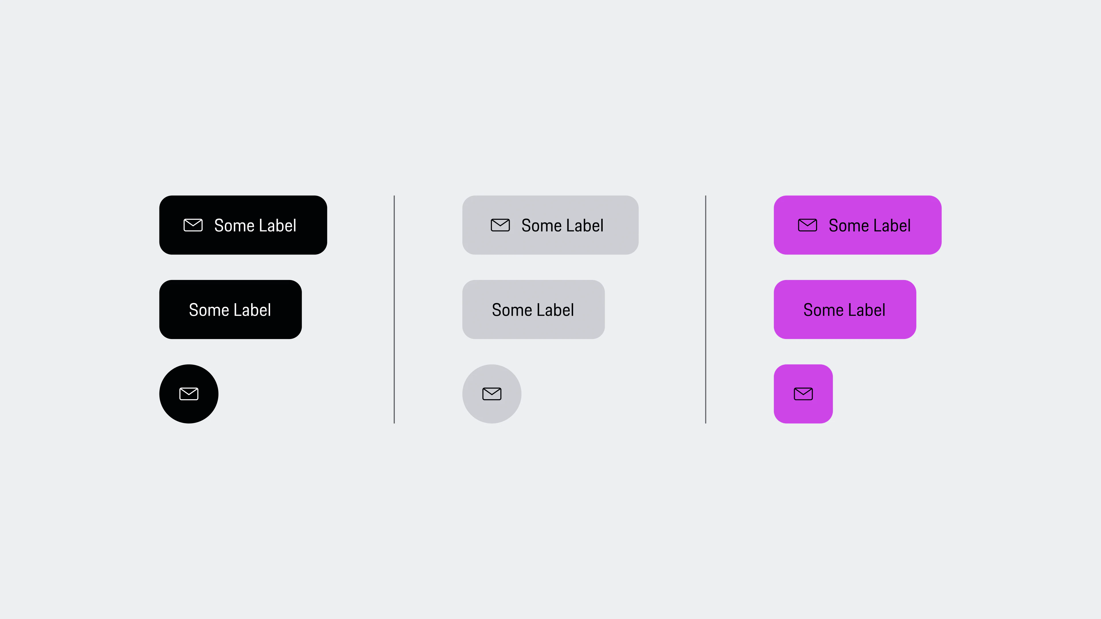
Buttons & Links
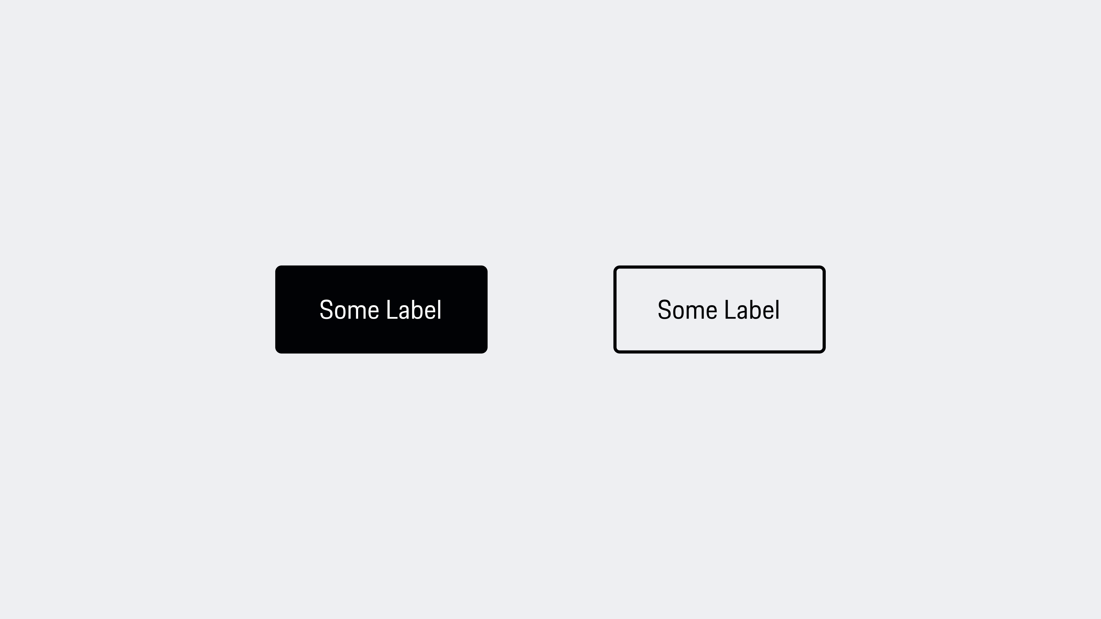
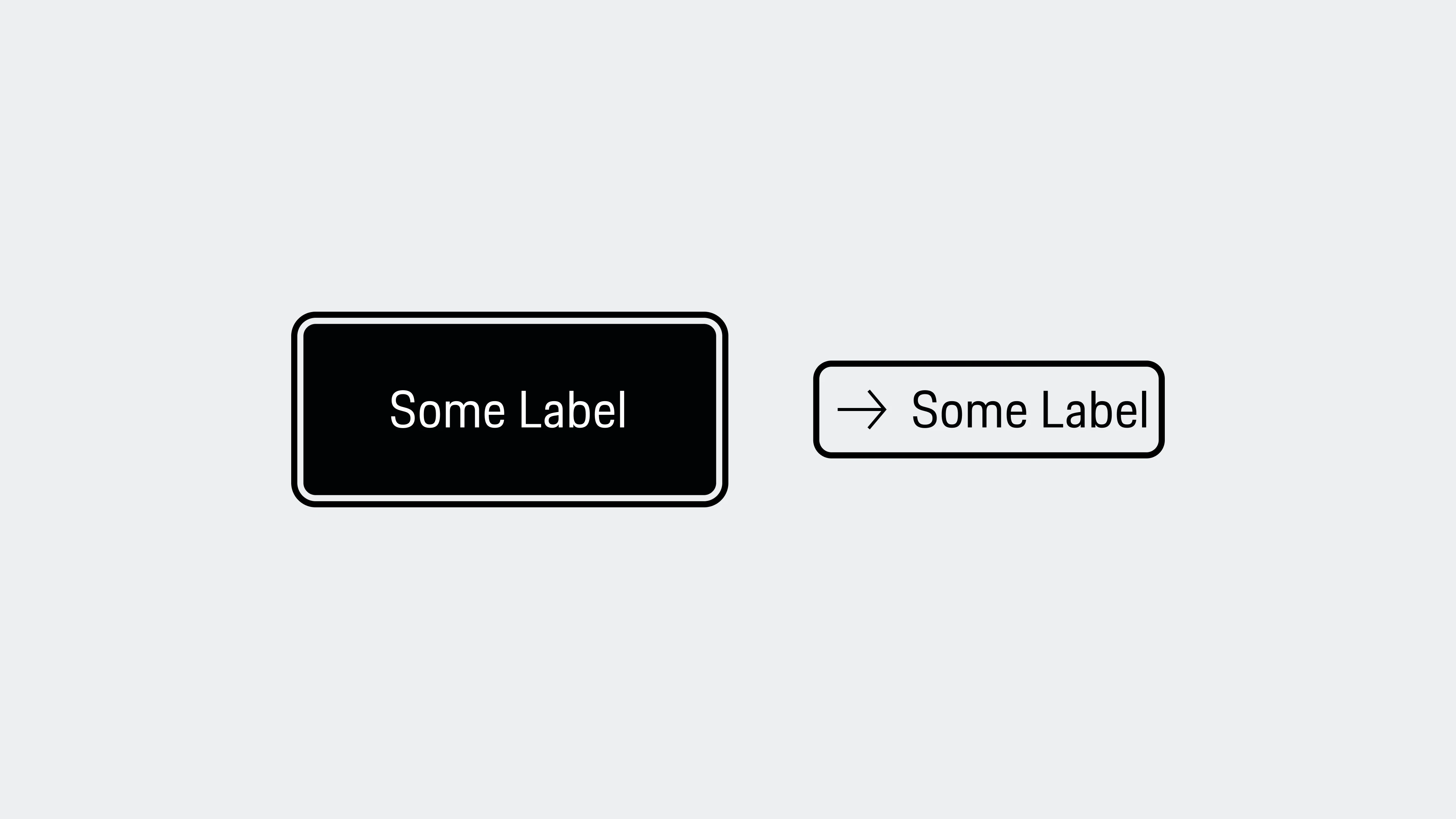
Primary and secondary buttons use short, descriptive labels. Icons are reserved for recognisable actions such as sending, downloading, settings or documents—not repeated as decoration throughout a journey.
Guideline · Never place two actions of the same hierarchy side by side.
02.9
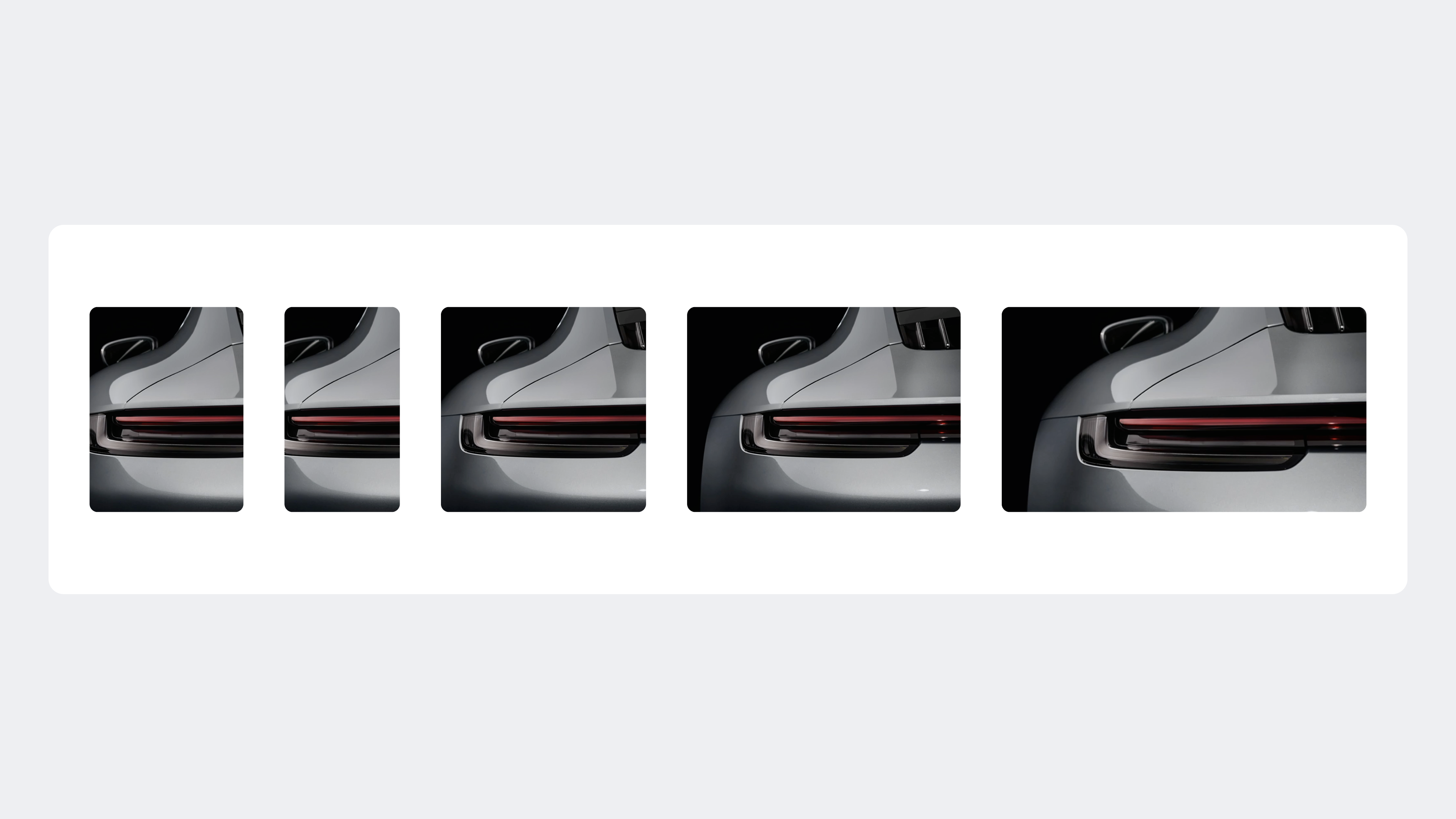
Aspect Ratios
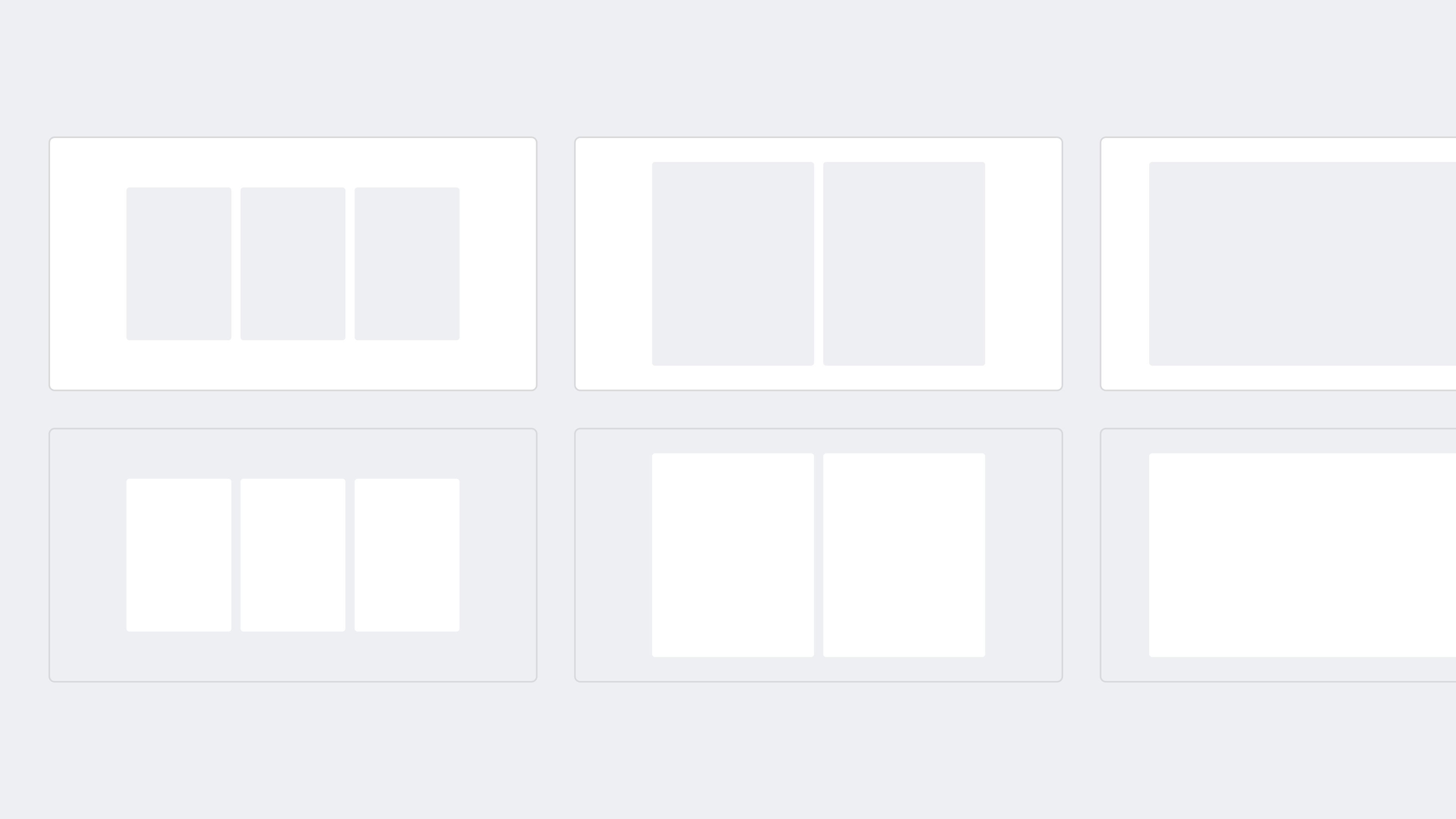
Defined ratios create consistency across images, videos, assets and containers. They remain stable across viewports, with deliberate adjustments allowed on smaller screens when space can be used more effectively.
4:3 / 3:416:9 / 9:161:1
Guideline · Choose from the shared ratio set before introducing a new crop.
03 · Styles
A small set of visual decisions keeps every product recognisable.
Instead of documenting every token here, this selection shows the foundations with the greatest product impact: responsive composition, fluid type, shared geometry, accessible interaction and controlled depth.
01 / 05
03.1
Grid & breakpoints
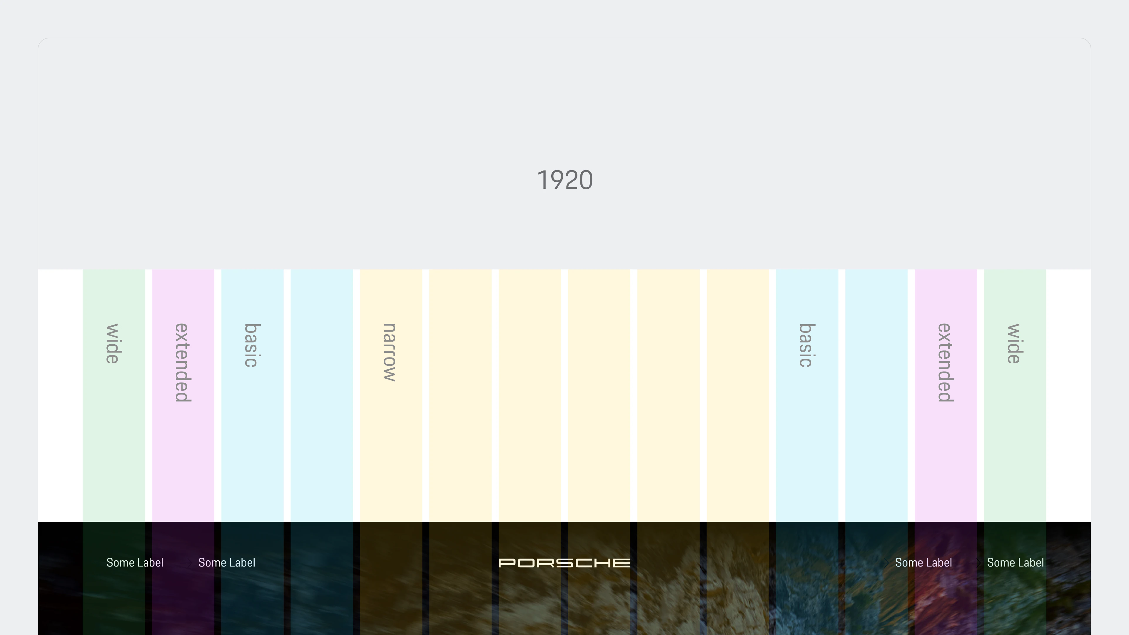
A centred 12-column grid holds journey content, while 14- and 16-column ranges give media, containers and sidebars the space they need. The same logic adapts across five product breakpoints—from 320 to 1920 pixels.
Style rule · Responsive behaviour belongs to the foundation, not the exception.
03.2
Fluid typography
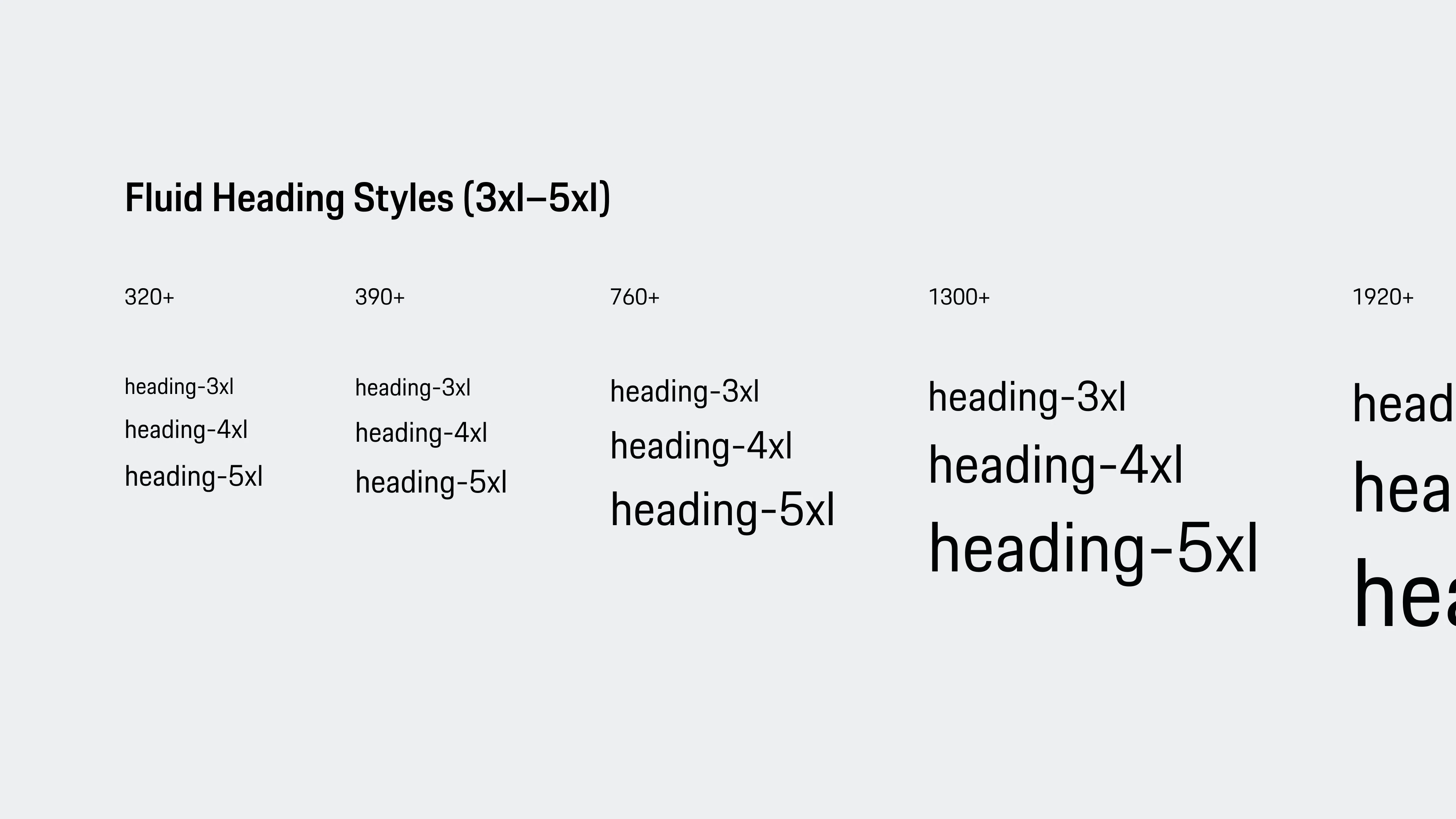
Porsche Next in Regular and Semibold forms one controlled type system. Ten fluid styles scale with the viewport, preserving hierarchy and legibility without product teams inventing custom sizes.
Style rule · Use a named type role, not an isolated font size.
03.3
Shape tokens
Three radii create a visible hierarchy: 4 pixels for controls, 8 for nested elements and 12 for containers and imagery. One- and two-pixel borders cover separation, outlines and interaction without decorative variation.
Style rule · Geometry communicates role before it adds character.
03.4
Focus states
Focus is designed as part of each interaction pattern, not added after the component is finished. High-contrast outlines remain visible on light and dark controls while technical exceptions are documented explicitly.
Style rule · Every interactive state must remain perceivable without a pointer.
03.5
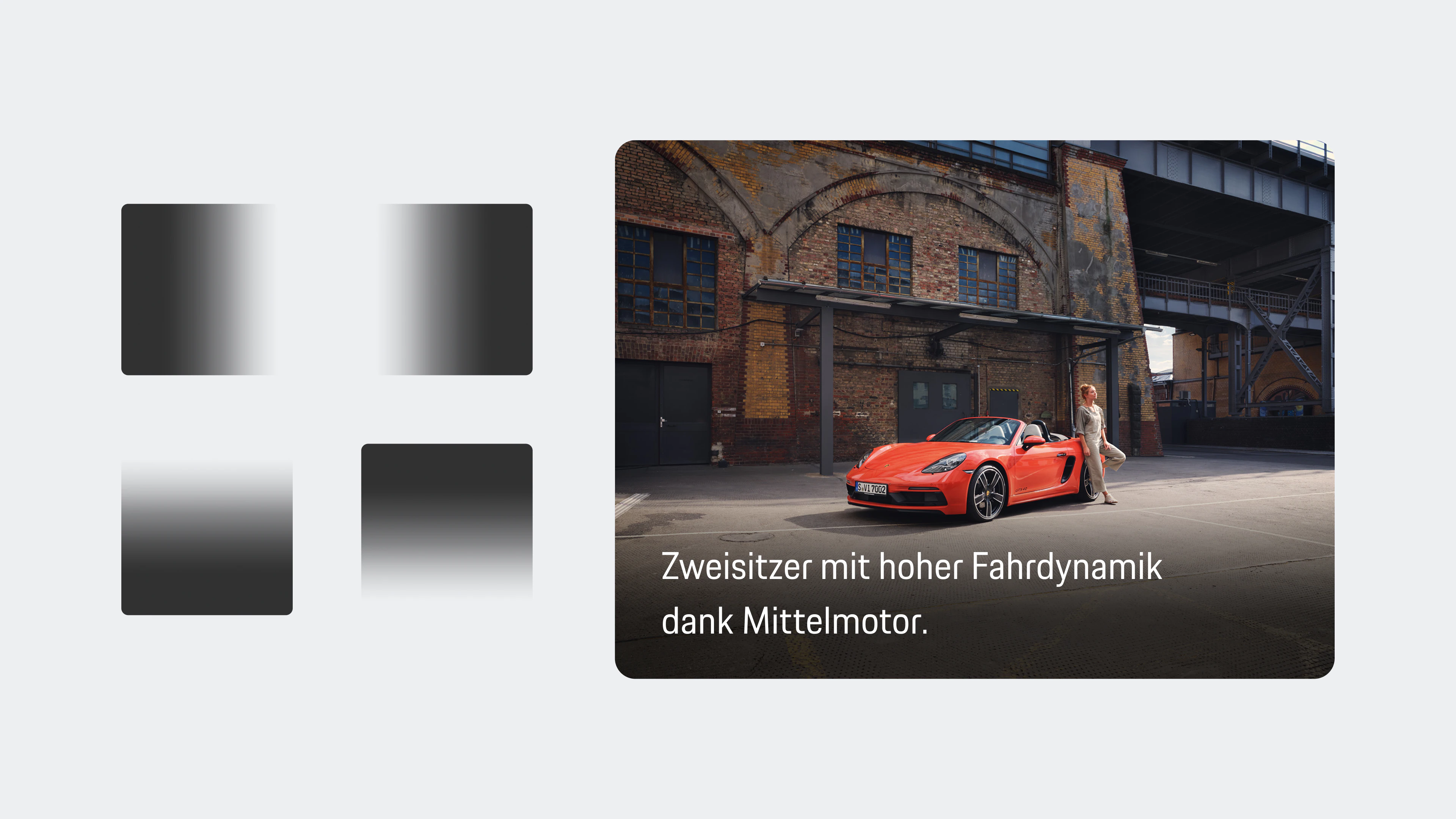
Depth & media
Gradients, elevation and frosted surfaces are functional tools for legibility and hierarchy. Direction follows composition, transitions are smoothed and the content determines how much visual treatment is needed.
Style rule · Add depth only when it clarifies content or interaction.
04 · Components
Components turn the system into predictable product behaviour.
I designed components as reusable product decisions rather than isolated UI elements. Each pattern brings together hierarchy, responsive behaviour and accessibility so teams can solve recurring user needs consistently.
01 / 06
04.1
Header
I treated the header as the product’s orientation layer: brand, navigation and high-frequency actions stay recognisable across desktop and mobile. The wordmark gives way to the crest only when space demands it.
Component decision · Keep orientation stable while the layout adapts.
04.2
Button
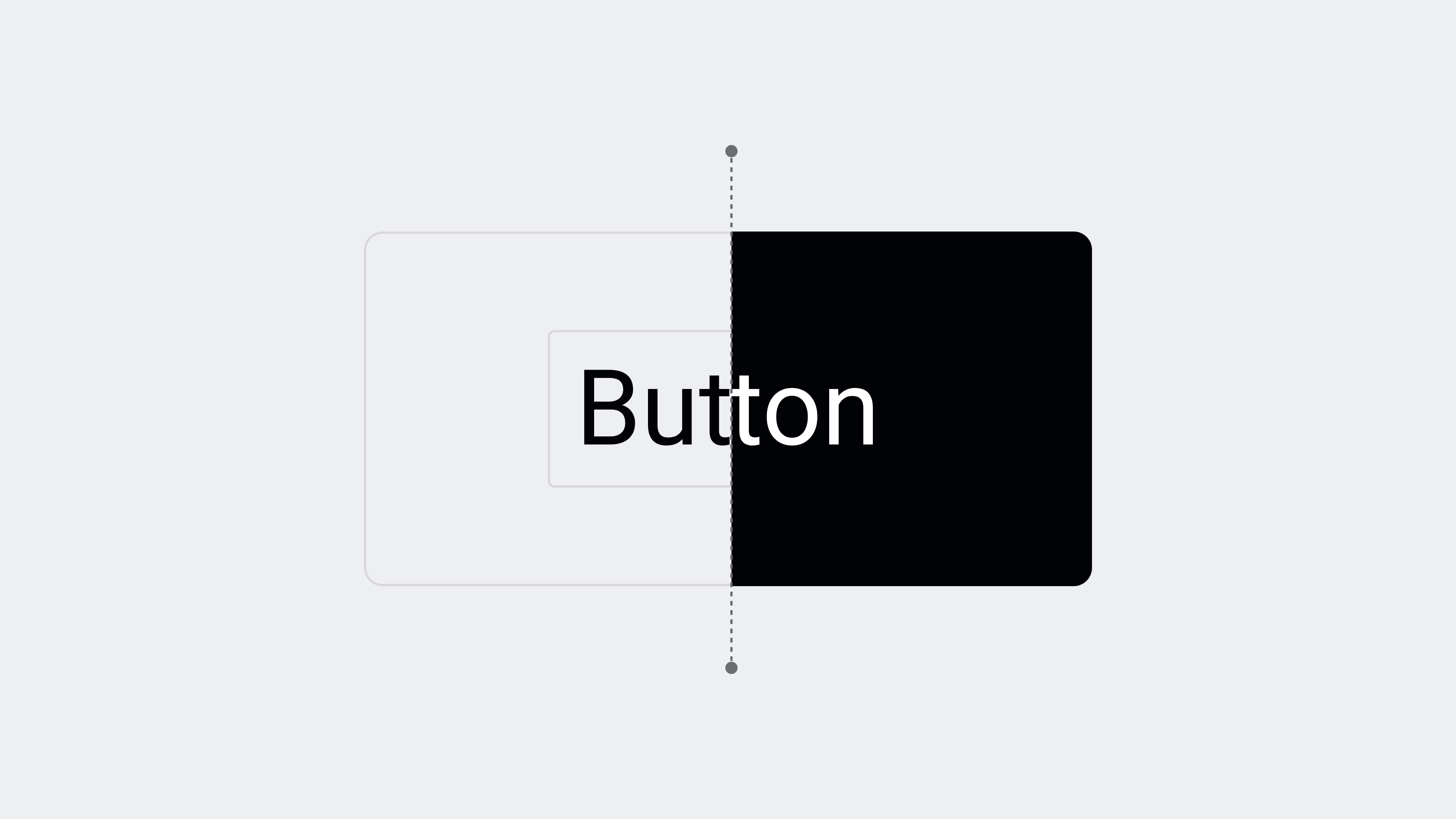
Buttons make priority visible. Primary and secondary variants guide the next action, while concise, visible labels keep intent clear. Icon-only actions are reserved for familiar tasks and always receive an accessible name.
Component decision · One clear next action is stronger than competing emphasis.
04.3
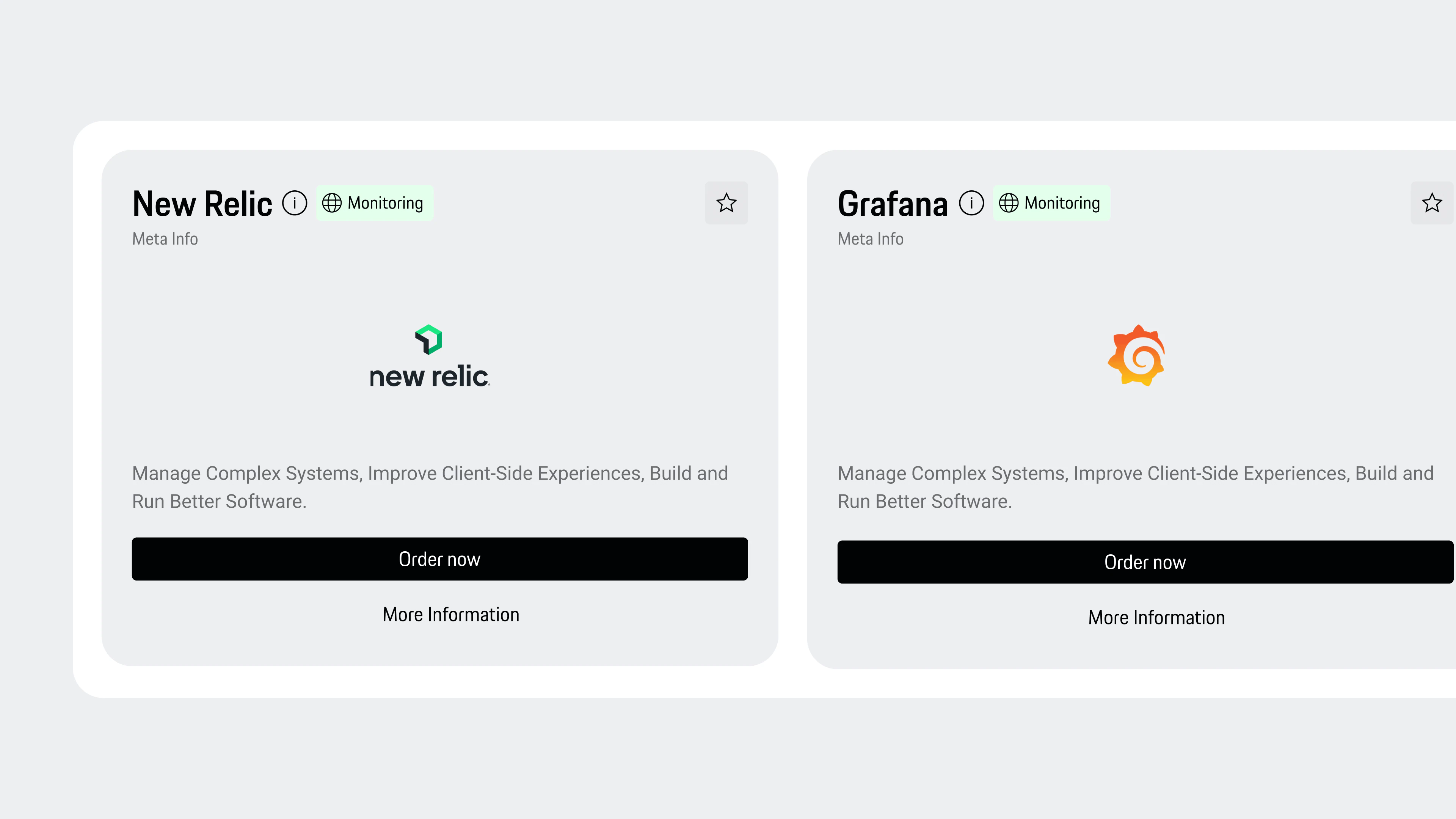
Card
Cards turn mixed content into a repeatable decision unit. A stable anatomy for title, context, media, status and actions lets products vary their content without changing how people scan or compare it.
Component decision · Keep the structure predictable and let the content create distinction.
04.4
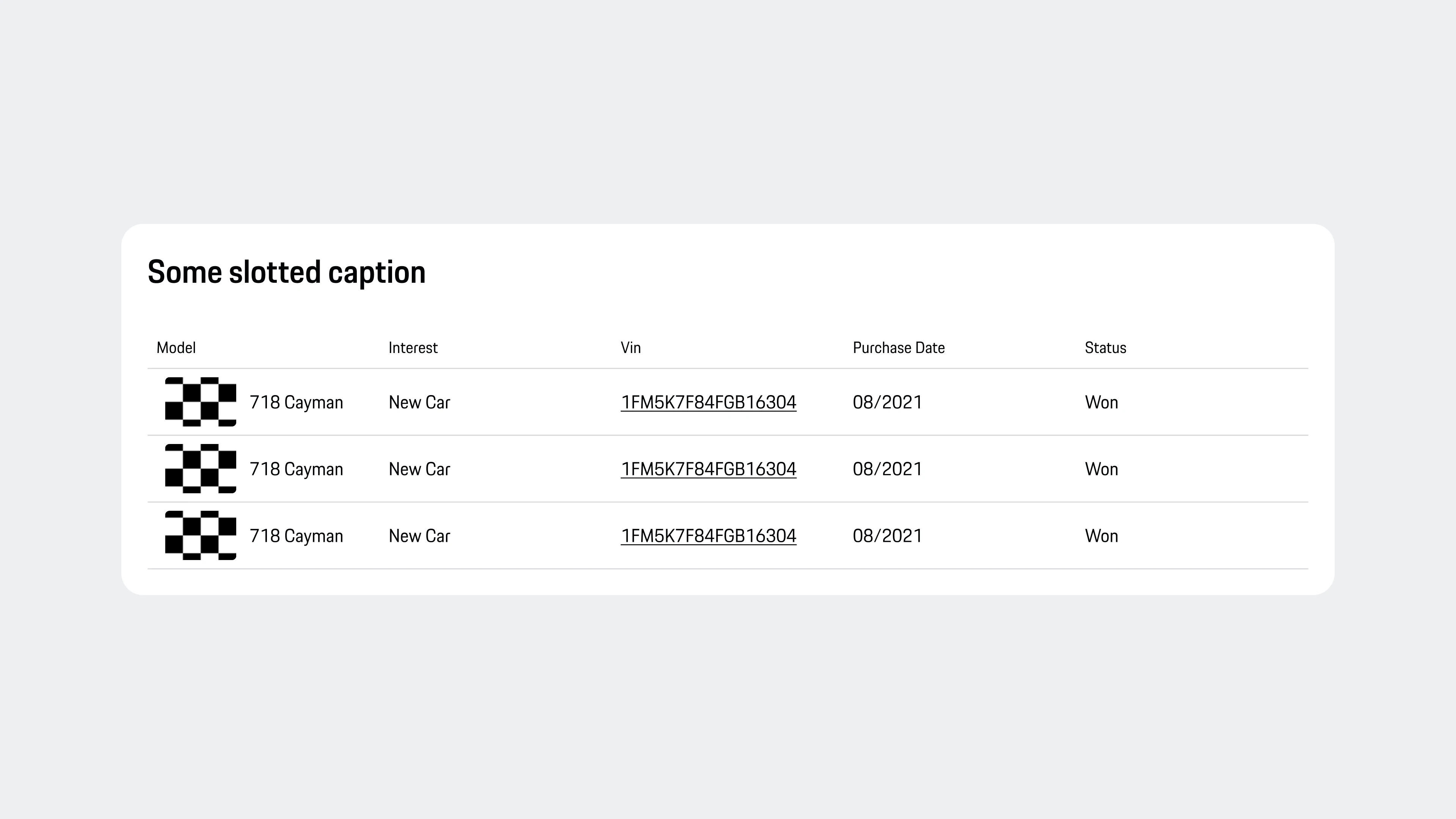
Table
Tables support information-rich tasks where comparison matters. Sortable columns, rich cells and a clear row structure make dense content scannable without sacrificing keyboard or screen-reader access.
Component decision · Preserve comparison, even when cells contain more than text.
04.5
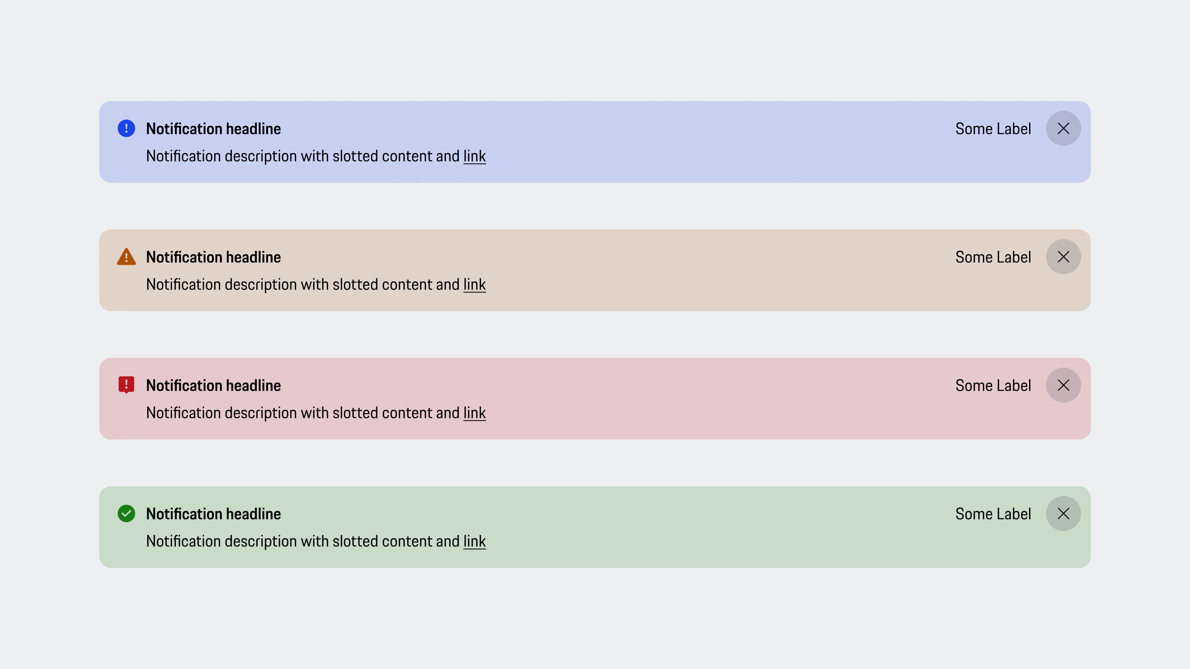
Banner
Banners give feedback without forcing people out of their flow. Information, warning, error and success share one structure, while message, severity and optional action remain recognisable without relying on colour alone.
Component decision · Match the prominence of feedback to the consequence.
04.6
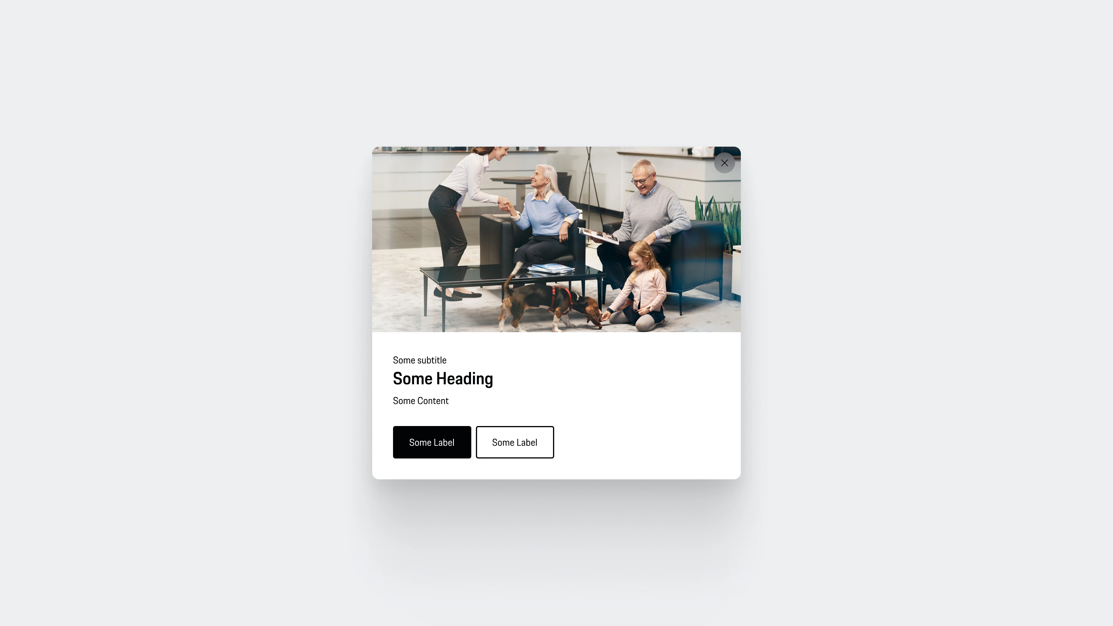
Modal
Modals deliberately interrupt the journey, so I reserved them for critical information and irreversible decisions. Clear context, explicit actions and a safe way out help people understand the consequence before committing.
Component decision · Interrupt only when continuing unnoticed would be riskier.
05–06 · From templates to products
Components become repeatable product structures.
Templates establish proven compositions, while examples show how the system flexes across products without losing its character. This final layer turns reusable parts into coherent journeys.
Impact
What changed
A scalable UI foundation reused across Porsche’s digital products.
Reusable, accessibility-conformant components that reduce design and development rework.
A consistent digital brand experience independent of which team builds the product.
Documentation patterns that shortened design-to-development handoff.
Reflection
Design systems taught me the discipline behind every product I design now: decide the rules, document the exceptions, and treat consistency as a user-facing feature. That systematic mindset carries directly into B2B SaaS and AI-assisted product work.